Google Partner Badge

How To Convert More Visitors On Electrician Websites

A practical guide to turning more electrical website visitors into booked calls, quote requests, and service inquiries.


By Rob Gillan

Screenshot of an electrician website service page

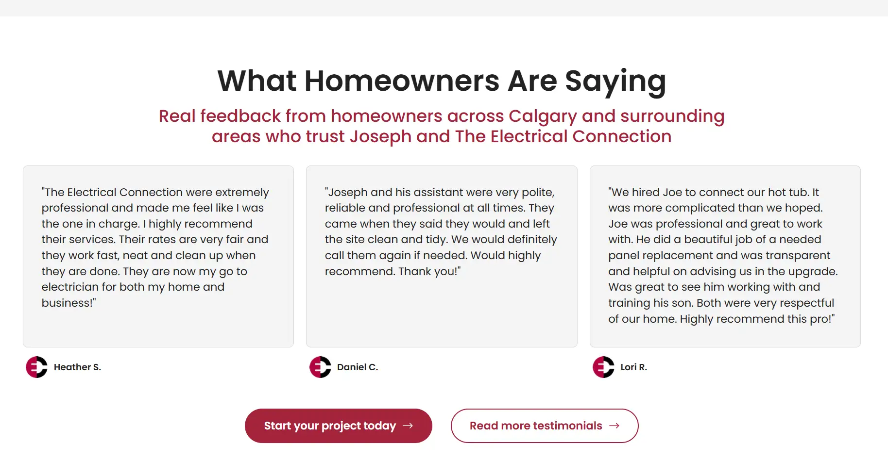
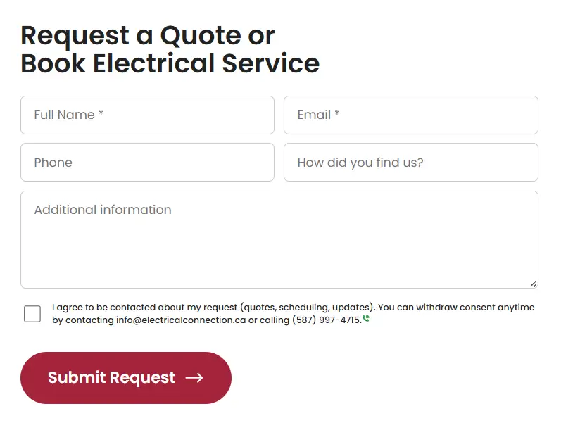
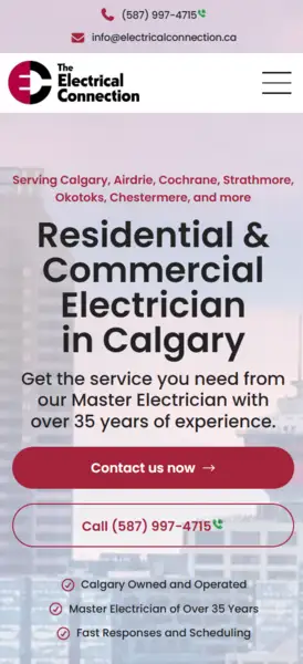
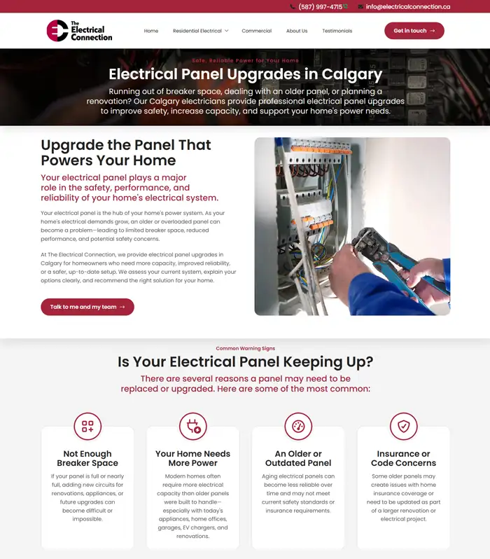
Start with a promise that matches the job the visitor is hiring you for

In our experience, electrician websites leak leads when the headline is generic and the page makes people work to figure out whether you handle the exact problem they searched for. Google’s people-first content guidance asks whether a page clearly demonstrates first-hand expertise and leaves the visitor feeling they learned enough to achieve their goal. 1

For electricians, that usually means naming the job plainly: panel upgrades, EV charger installation, emergency electrical repair, service upgrades, generator hookups, or commercial work. A vague “full-service electrical contractor” message might be accurate, but it does less work for the visitor than a headline that immediately confirms, “Yes, you’re in the right place.”

The opening message should help the right visitor self-identify fast, feel confident that you understand the problem, and show the next step without them having to waste mental energy trying to find your offer. It sounds simple, and it can be, but in our experience, many websites get this wrong.

Make the first call to action impossible to miss

This part is less about clever copy and more about lowering friction. Some visitors want to research, others want to call right now. Your primary action should be visible as soon as the page loads, whether that’s calling for urgent service, requesting an estimate, or booking an appointment.

This is a conversion rule that has held up across contractor sites we’ve worked on: when the action is obvious, the page feels easier to use. When the page hides the action, visitors hesitate, keep scrolling, or leave.

For electrician websites specifically, the call to action should also match the page intent. Emergency pages should make calling effortless. Estimate-driven pages should make forms feel low pressure and easy to start. Commercial pages can support a more business/consultative CTA if the project is higher-consideration (longer sales cycle, bigger investment, etc.).

Use trust signals to reassure someone new

BrightLocal’s 2026 Local Consumer Review Survey found that 97% of consumers read reviews for local businesses, 85% are more likely to use a business after reading positive reviews, and 54% go on to visit the business’s website after reading positive reviews. 2 For a local electrician, that means reviews are not a “nice bonus”. They’re part of the evidence someone uses before they decide to call.

That lines up with research from the Medill Spiegel Research Center that found reviews had a larger effect on higher-priced purchases than lower-priced ones. 3 Electrical work is not e-commerce, so this isn’t a one-to-one comparison, but the lesson is useful: when the perceived risk or ticket size goes up, social proof matters more.

This is why we like electrician sites to stack trust signals instead of relying on one. Reviews are a strong start, but they work better when they sit beside license information, years in business, recognizable project types, warranty language, real job photos, and proof that the company is active in the service area now.

Screenshot of an electrician website testimonial section

Match each service page to one buying intent

Google Ads treats both ad relevance and website landing page experience as part of ad quality, and Google says effective landing pages are key to getting conversions from Google Ads traffic. 4 5 In plain English, a page about EV charger installation should feel unmistakably like an EV charger page, not a generic electrical services page with a short paragraph buried halfway down.

That being said, it’s not an SEO promise. Splitting pages by service doesn’t guarantee rankings by itself. The safer takeaway is that a tightly matched page usually improves clarity for visitors, supports ad relevance, and makes it easier to write useful copy for one specific problem.

If you offer distinct services with distinct search intent, there’s usually a strong argument for giving those services their own landing pages. That helps the page answer the exact question the visitor showed up with instead of forcing every job type through the same generic funnel.

Screenshot of an electrician website contact form

Reduce friction in the quote request flow

Baymard’s checkout research found that the average checkout form contains ~11 form fields and 18% of users who abandoned did so because the checkout felt too long or complicated. 6 Their form-layout guidance also warns against multi-column forms because users are more likely to overlook fields and misinterpret how the form is grouped. 7

Contractor lead forms are not e-commerce checkouts, but the friction in a poorly laid out form can be similar. The more effort the first step seems to require, even subconsciously, the more likely a prospect is to hesitate. We usually recommend collecting only the details needed to start your sales conversation: name, phone, email, and maybe the service type or ZIP code if it improves routing to the right person in your organization.

Everything else should earn its place. If a question is only useful later in the sales process, it probably doesn’t belong in your website lead form.

Show proof that you work where the customer lives

Google says local results are based primarily on relevance, distance, and prominence, and that complete, detailed business information helps Google understand a business and match it to relevant searches. 8 This doesn’t mean that adding a neighborhood name to a page guarantees local rankings, but it does mean specificity matters.

On the page itself, we want the same kind of specificity people expect from a strong Business Profile: real service-area references, consistent contact details, clear service coverage, and proof that your company actually works in the communities you mention. For electricians, that can mean naming municipalities, showing completed work, and speaking to the kind of homes or buildings common in your service area.

The payoff is not only with an algorithm like Google’s, it’s human. A homeowner is more likely to trust a company that sounds like it genuinely serves their neighborhood than one that feels copy-pasted across an entire region.

Design for mobile urgency, not just desktop polish

Google Ads Help says a 1-second delay in mobile can impact mobile conversions by up to 20% in retail, and web.dev’s performance guidance summarizes a broader body of evidence connecting speed with user retention, engagement, and business outcomes. 5 9 Electrician leads are not retail checkouts, but directionally this is still useful: slower pages create more opportunities for hesitation and abandonment.

For contractors, we usually treat mobile as the default conversion environment. A visitor may be on a driveway, at work, or standing beside a panel that just failed inspection. Your website’s tap targets need to be easy to hit, your phone numbers should be easy to find, and your load times should feel quick on cellular data, not just on wifi.

This is one reason we care more about readable spacing, sticky contact options, and fast pages than overly decorative flourishes that look impressive during a design review, but slow down real-world visits.

Screenshot of an electrician website on a mobile viewport

Repeat the conversion path throughout the page

Visitors do not all decide at the same moment. Some are ready after reading the headline, while others need the trust section, service details, or proof-of-work content before they’re comfortable reaching out.

Our rule of thumb is simple: every page should make the next step visible more than once. Show your primary CTAs after the hero, after the trust-building section, and again lower on the page so people can act at the moment they feel ready. This is much easier mentally than hunting for the first button they saw.

Screenshot of an analytics dashboard

Measure what visitors do so you are not guessing

Google says conversion tracking shows you what happens after a customer interacts with your ads and helps you identify which keywords, ads, ad groups, and campaigns drive valuable customer activity. 10 Google also says Smart Bidding uses Google’s AI to optimize for conversions or conversion value and so conversion tracking is required before you can use those bidding strategies. 11

For electrician websites, this means your site should not just sit there with some contact info on it. Your site should report meaningful outcomes back into your marketing stack wherever possible: calls, form submissions, booked estimates, or other real lead actions. Without that feedback loop, campaign optimization is slower, landing page decisions are fuzzier, and you’re more likely to keep spending money on pages that seem fine, but underperform.

We try to track the moments that tell you where friction lives: CTA clicks, form completions, phone calls, and the service pages that produce the best lead quality. This gives you something better than intuition when it’s time to improve on the next round.

Treat the website like a salesperson, not a brochure

The job of an electrician’s website isn’t to say everything at once. It’s to guide the right visitor toward contact with ease and confidence.

Research can tell us a lot about reviews, speed, local visibility, and landing pages. The real craft comes in applying those research principles in a specific business with a specific service mix, service area, and buying process. That’s why many electrician websites feel generic and forgettable: nobody knew how to effectively implement these strategies.

The strongest pages usually do a few things well: they make the service obvious, they lower the effort needed to act, and they show proof that your company can be trusted.

Sources

  1. Google Search Central: Creating helpful, reliable, people-first content

  2. BrightLocal: Local Consumer Review Survey 2026

  3. Medill Spiegel Research Center: How Online Reviews Influence Sales

  4. Google Ads Help: About ad quality

  5. Google Ads Help: Evaluate the performance of your landing pages

  6. Baymard: Checkout Optimization - 5 Ways to Minimize Form Fields in Checkout

  7. Baymard: Avoid Multi-Column Forms

  8. Google Business Profile Help: How to improve your local ranking on Google

  9. web.dev: Web performance

  10. Google Ads Help: About conversion tracking

  11. Google Ads Help: About Smart Bidding